Earlier this year, I enrolled in an Open University photography course. This is a 10-week online course, with classes and exercises sent each week, working towards the submission of a 10-image portfolio which is reviewed by course mentors and judged on Visual Awareness and Technical Quality.
There is no formal qualification at the end, but the course is supported by the Royal Photographic Society, of which I am a member, and can be considered preparation for pursuit of the society's own distinctions.
I submitted my portfolio back in May and, a few days ago, received my final award and feedback. Below is the portfolio, and below that, you can read the feedback provided by the anonymous reviewer.


"Visual Awareness
Gareth, I really enjoyed looking at all of your pictures, which were visually very good. One of the things that works for you is the diverse range of subjects photographed and the unique treatment you have given each. These range from the vast landscape to the individual tree, indicating a willingness to experiment with differing genres and come out of any comfort zone you may have. This is often the best way to improve your photography and develop your own style.
I like your choice of “Splashes of colour in an Italian town” (image 1) to open up your sequence. There is so much going on in both colour and shape that you keep the viewer looking for ages and the longer you keep a viewer looking the better. Also, by the time they have finished looking they can travel through the arch and on to the next shot in the sequence. And the next shot “Pine trees in mist & snow” (image 2), is for me the best shot in sequence. On the face of it, it is so simple but, each time you look at it you see something new. It also has a great feeling of depth and that draws you further in to your set.
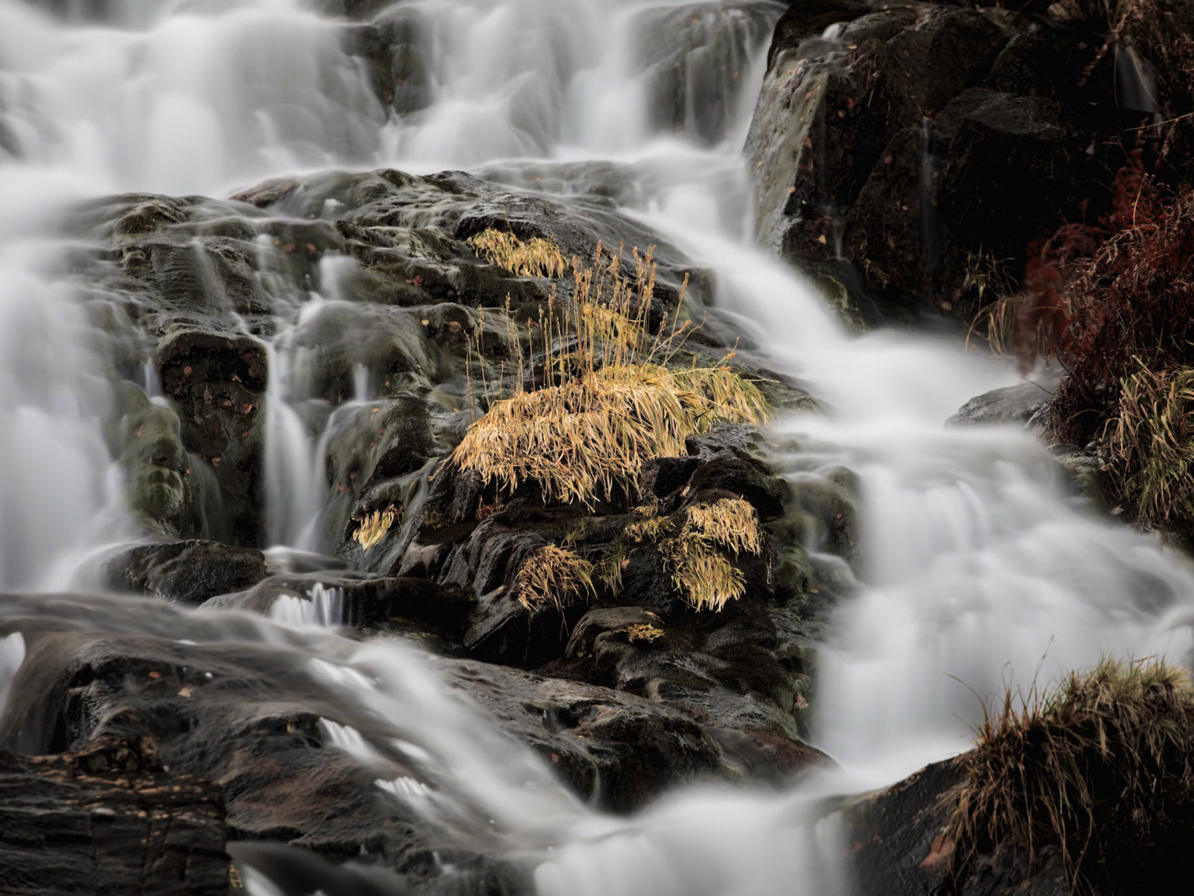
“Water moving through a slow landscape” (image 9) is very well shot and has a great feeling of depth and movement. I think, because of its shapes and direction of flow, it would have been an ideal shot to end your sequence with. The water forms a big landscape shape, like a wrong way-round book end, but it flows back in to the rest of your images and would encourage the viewer to go in for a second look.
Technical Quality
An excellent sequence on a technical level which maintains a very high standard throughout. This indicates a well above average depth of skills for this course. A good technical aspect of your photographs is that you have chosen to photograph your subjects in a variety of different and occasionally difficult lighting conditions, to get some very good results. This shows a growing comfort at the taking stage and an appreciation of both yours and the cameras abilities.
In your “A Parisian scene” (image 7) shot this editing technique has been well carried out, but, more importantly, it is one that is appropriate for the subject; it also gives you the same feel as the great street photographer, Henri Cartier-Bresson. Many shots have been spoilt because, even though a technique has been well carried out, it has been applied to an unsuitable subject. Here, it enhances and complements the shot rather than detracting from it. It has also been used to a very dramatic effect in “Shadow and light” (image 6)."
______________________________________________________________________________
As well as submitting the images, we were also tasked with several written tasks, including a technical description of one of the images. This is what I wrote for image 4:
“Image 4 (“Early morning calm”) is an example of a previsualised photograph. Whilst walking along a coastal path in southern France I noticed how the mole, made from huge boulders, cut through the sea (which at the time was quite rough). I liked the juxtaposition of the hard stones in the liquid sea but knew the afternoon light was too harsh to capture the textures. I also thought a calm sea would better convey the contrast.
With that in mind, I went back early the next day, for the soft light of dawn, and searched for a POV that would bring the rocks below the horizon (to emphasize depth). As the sea was still quite choppy that morning, I used a 10-stop neutral density filter to allow for a long exposure of around 70 seconds whilst keeping the aperture relatively open (and sharp) at f8.0. As I was using a relatively wide-angle focal length (33mm), I removed my circular polariser to avoid distortions in the tones of the sky. As the main subject was the sea against the rocks, I opted to frame the shot with the sea taking up two thirds of the image, pushing the rocks and lighthouse towards the top of the frame. This also helped accentuate the depth of the image.”
______________________________________________________________________________
The anonymous judge responded with this:
"Apart from showing a good visual awareness in your answer to question two, the description and motivations for taking “Early morning calm” (image 4) show other good skills. Firstly; it is a very good technical description of how you took the photograph, but more importantly it shows you have one of the photographers’ greatest skills, and that is planning. You knew what sort of final result you wanted so did not take the shot at the wrong time but came back when you knew you could get just what you wanted, used the right kit and got an ideal exposure. Planning is an often-overlooked skill, but those that can do it well generally get better results than those that cannot. Well done."
So, overall, I’m very happy with the feedback and feel that my chances are good at securing a distinction form the RPS. Watch this space!